So you’ve done everything right. You have a website, an email address with your domain (not just a gmail account), an online booking engine (for example Rezgo), and you’re starting to see some traction. But your site just doesn’t seem to be converting customers the way that you had hoped. Well, it could be that your site is suffering from some of these website design mistakes.
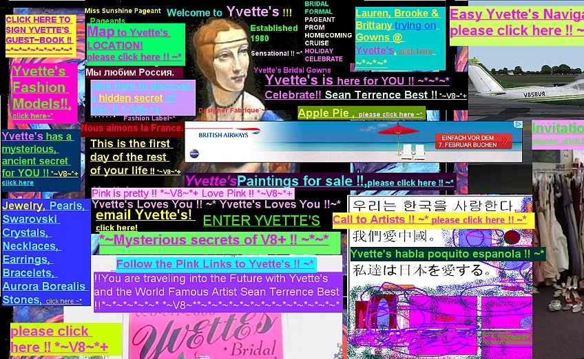
If you’re interested in looking at some truly awful websites, head over to Websites From Hell.
1. Splash page or fancy flash intro
This is a bit like asking someone to stand and watch an advertisement before they can enter your front door. Do you really want to force your website visitors to look at a splash screen first before they can click through to your site? No, if you have a splash screen or some kind of splashy flash intro, get rid of it. Remember that Flash also doesn’t work on most mobile devices, so you are already alienating 25% of your web visitors. You can read more about why splash pages are bad in this article from Devin.
In the same vein as the splash page/flash intro, do not auto load music in the background when a customer lands on your site. Nothing is more annoying then to hear music blasting when none was expected. If you have a music background, remove it asap.
2. Overly complexificated navigation
I realize that’s not a real term, but you get the point. On of the most common errors with websites is creating a navigation menu that is overly complicated. Keep your navigation simple and consistent throughout your site. A common convention is to place your main navigation menu in the upper right hand side of the site. A standard menu for a tour/activity business might include:
- Home
- About Us
- Our Tours (link to your Rezgo site)
- Blog (if you have one)
- Contact Us
- Booking Terms & Conditions
Do you really need more than that? If you do have a lot of pages on your site with rich information, then that’s great. Just remember that your customers are going to be looking for specific kinds of information on your site. Make sure that the critical stuff like your tour information and pricing is easy to find.
3. Buried or hard to find contact information
Even if you don’t want your customers to pick up the phone and call you or send you a letter, it’s important to let them know that they can. Your website should provide your customer with all the information they need to make a purchasing decision and as long as you live up to their expectations, chances are they won’t have a reason to pick up the phone and call you. Adding your contact information to the footer of your website is a good idea, since that is a common place for customers to look if they are close to the bottom of a page on your site.
4. Bad color choices and hard to read fonts
Your content is only going to be interesting and persuasive if your visitor can read it. One of the most common mistakes with web design is sacrificing readability for layout or design purposes. If you have a dark background, use a light easy to read font. If you have a light background, use a dark font. Pretty straightforward right? You’d be surprised how many sites I have seen with dark backgrounds and green or red colored fonts. Remember the old adage, just because you can do something doesn’t mean you should. If your site is suffering from a colored font overload, simplify it now. Not only to high contrast easy to read and attractive color schemes enhance the look of your site, it makes it easier for your customers to actually read about what you offer.
For more information about fonts and readability, I highly recommend this post from Ben Hunt.
5. Clutter
Images, videos, and text are all great things to have on a website. But, they have to be organized in a way that make sense for your customers. Jamming everything onto the page without any consideration for layout or whitespace will only make it hard for your customers to scan your page and find what they need. Avoid cluttering up your site with ads or images that are not directly relevant to the customer experience. I recently had a tour operator ask me if they should have a banner ad on their site for a potential affiliate partner. My answer was “No”. Why? Because all you are doing when you add distracting media to your site is giving your potential customer an excuse to leave your site. Once they leave, the likelihood that they will return is greatly diminished. Keep your content pages clean and well organized. With Rezgo, your tour detail pages are always consistent, so you don’t need to worry about them, but the pages on your regular website should have a form and structure to them that make the customer experience consistent from page to page.
Think like your customer
Imagine yourself as your customer. When you go to your site, how hard is it for you to find the information that you need? Obviously, it’s going to be difficult for you to go through this process in an unbiased way. Your best bet might be to get a friend or colleague to do this for you. But take the time to do an honest evaluation of your site and how effective it is for your business. Remember that, according to Google, 82% of leisure travelers start their holiday research online. The chances are very good that a customer’s first experience with you will be your website. Now is your chance to make sure you are putting your best face forward.


